


left to right: Lars (concept and design), Christin (illustrations), Denise (concept) and Maurits (microsite and app).

In our latest “In-Use” case we caught up with the team over at Berlin based communications agency Blumberry to chat to them about their latest project in which FF Chartwell and FF Tundra were a saving grace.
Who was your client and what was the topic of this project?
Our client was Huawei Technologies Germany GmbH, one of the leading suppliers of telecommunication solutions employing more than 150,000 people across 140 countries.
The project, named “Germany and China - Perception and Reality” was carried out in cooperation with the renowned German Institute of Global and Area Studies in Hamburg (GIGA) and the market research institute TNS Emnid in Bielefeld. Its aim was to examine the perceptions that Germans and Chinese have of one another in order to identify stereotypes before assessing them in a scientific context. In other words, what perceptions do the different nationalities have of each other and can they be refuted by facts?
Huawei had initially ran the study two years previous and so were keen to compare these results with those from the new study. However to use both lots of data to create a large, graphically and scientifically complex document that could be made accessible to a wider audience without hindering the scientific element of the content presented us with quite a challenge.
How many people were involved?
As a team we were required to handle all aspects of presenting the survey results, and so during peak periods we had up to 15 people on the team.
Our responsibilities included the programming of the study’s microsite, implementation of a lavishly staged exhibition of the study results (in the form of an Experience Walk) and the production of collateral such as posters and bags.
How did you decide on the layout?
The layout of the previous study was a great help. From this we were able to quickly see what worked with the data and what could be improved. We initially tried several versions of the layout, from the multi-column to single-column pages, as we wanted to avoid the graphics and text appearing to have no visible connection to each other. Instead, they should relate to one another and not inhibit the flow when reading the text. Against this background the one-sided layout proved to be the most effective.
How did you choose the typefaces that featured in the final project? And in what way did the chosen typefaces help with production of the document?
We made the selection of typefaces very early on in the design process. We tried and tested multiple typefaces, including a sans serif typeface that is defined in the design manual. However, in continuous text weaknesses were obvious instantly – after all this particular sans serif typeface was originally designed for “way finding” and not for ease of reading when used for lengthy texts. For this reason, it was clear that we needed a serif for such an extensive study. Moving from the expressive FF Yoga and
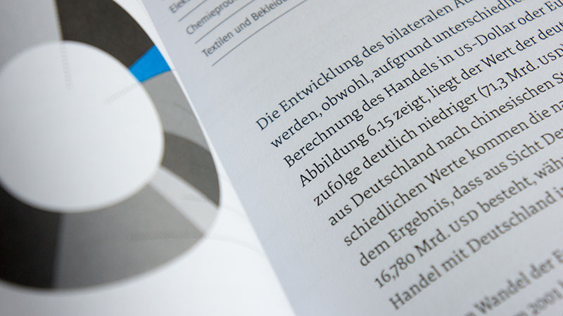
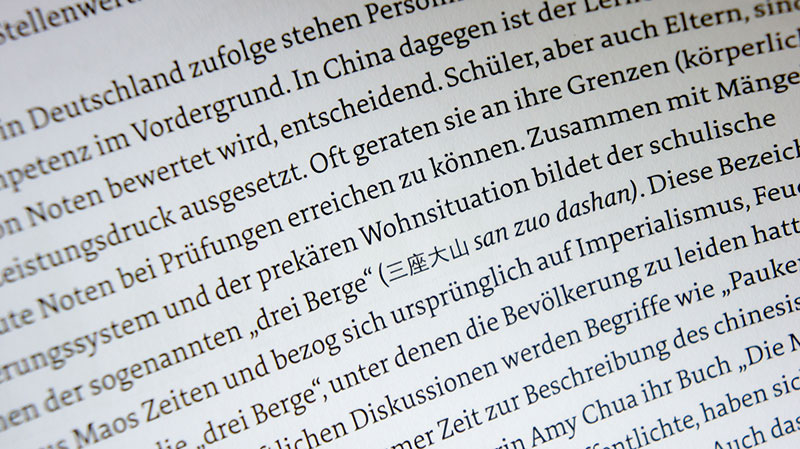
FF Tisa, we finally decided on the very reader-friendly FF Tundra by Ludwig Übele. FF Tundra’s quality in single-column layout with above-average long lines, made it the perfect choice for the study’s text.
For the development of the study’s graphics there was no way to avoid using FF Chartwell by Travis Kochel. With its focus around numerical data we hoped that FF Chartwell would save us an enormous amount of time. We had only a few weeks to build a variety of graphics from a data bundle of more than 1,000 pages, of which many of them contained graphical information and statistics.
Once we had all of the necessary data identified, extracted and excess material removed, the clear simplicity of FF Chartwell was very welcome. We would even go as far to say that had we been without this “chart tool” it would have been an even greater challenge to deliver on time.
Within a study of this size it is easy for mistakes to be missed. A graphical tool, such as FF Chartwell, helped to keep these errors to a minimum, because it works “only” by entering numbers, which as a result made the entire process less error prone.
We were also very grateful for FontFont’s detailed documentation on
FF Chartwell as well as the useful tips and tricks from FontFont’s Jens Kutilek’s video tutorial. As a result even our consultants could proofread the entire study and make corrections via InDesign’s simplified mode without having to be taught about OpenType features first.
What was the theme for the illustrations?
The style of the illustrations was closely coordinated with that of
FF Chartwell – simple, clear and concise. This resulted in simple icons that clearly illustrated the content without lacking details.

In the making


Survey impressions


About FF Tundra
FF Tundra is a narrow serif typeface with stressed forms and soft contours. Its concept grew out of an investigation into narrow letterforms and optimal readability. To avoid a fence-effect, FF Tundra’s letterforms emphasizes horizontal movement. Designer Ludwig Übele combined strong serifs and flat shoulders (see n) with open counters and heavy endings (see a, e, c) with a moderate degree of stroke contrast to achieve a balanced, legible typeface that is soft and humanist.
FF Tundra was designed for use in continuous text, but it is also suitable for general use in magazines and for headlines – especially the Extra Light. Extensive tests conducted by one of the major German weekly magazines Stern have proven that FF Tundra is one of the best modern serif typefaces for gravure printing. The design’s characteristics are sure to work in newspapers as well. The family consists of six weights from Extra Light to Bold, each with Italics and Small Caps and many OpenType layout features. FF Tundra received a Certificate of Excellence in Type Design at the 2011 TDC2 competition and was selected for the annual review of Typographica’s favorite typefaces of 2011.
FF Tundra was designed for use in continuous text, but it is also suitable for general use in magazines and for headlines – especially the Extra Light. Extensive tests conducted by one of the major German weekly magazines Stern have proven that FF Tundra is one of the best modern serif typefaces for gravure printing. The design’s characteristics are sure to work in newspapers as well. The family consists of six weights from Extra Light to Bold, each with Italics and Small Caps and many OpenType layout features. FF Tundra received a Certificate of Excellence in Type Design at the 2011 TDC2 competition and was selected for the annual review of Typographica’s favorite typefaces of 2011.


About FF Chartwell
FF Chartwell, designed by Travis Kochel, is a typeface for creating simple graphs.
Driven by the frustration of creating graphs within design applications and inspired by typefaces such as FF Beowolf and FF PicLig, Travis saw an opportunity to take advantage of OpenType technology to simplify the process.
Primarily suitable for Adobe Creative Suite, FF Chartwell for print uses OpenType ligatures to transform strings of numbers automatically into charts. The data remains in a text box, allowing for easy updates and styling. You simply type a series of numbers like: “10+13+37+40”. Turn on ligatures and a graph is created. Turn off ligatures to see the original data.


